If you are interested in building a website for the first time, or rebuilding an existing site that is outdated, you might have heard the term “microsite” tossed around, and wonder what it is and if it’s right for you and your business.
To learn more about microsite design, please read part one of this blog.
Today, we’ll be diving into a few of our recent projects, and talking more about the design and strategy behind it.
5 Featured Microsites
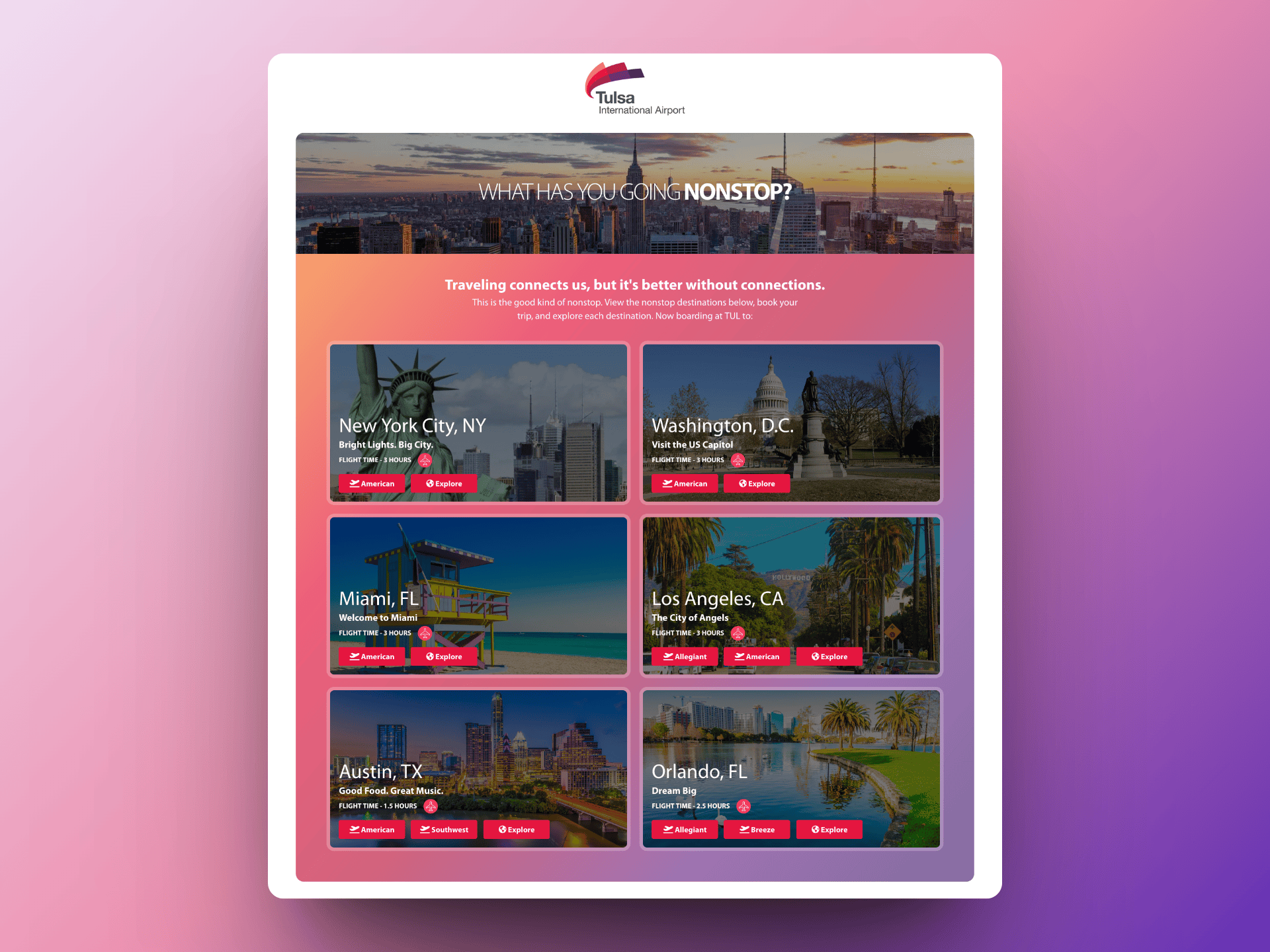
Tulsa International Airport – Nonstop Flights
The Strategy
Tulsa International Airport was running a specific marketing campaign to promote the 30+ direct flights out of Tulsa. To measure landing page views and other metrics that would demonstrate campaign success, a microsite with a unique domain and look and feel was the way to go.
The Design
We wanted this to be fun and colorful to inspire travel and adventure. It also needed to be dominated by high quality photos, and light on verbiage. We knew that most people would be arriving on this microsite from their phones, so it was crucial for this site to be optimized for mobile, and therefore reducing the overall scroll depth was a priority.
Because the exciting part about travel is the beauty and intrigue of the location itself, high-quality photos were the top priority. Next up on the list was showing the flight time and flight carriers, so that people knew quickly how long it would take to get there, and if the route was available through their preferred carriers.
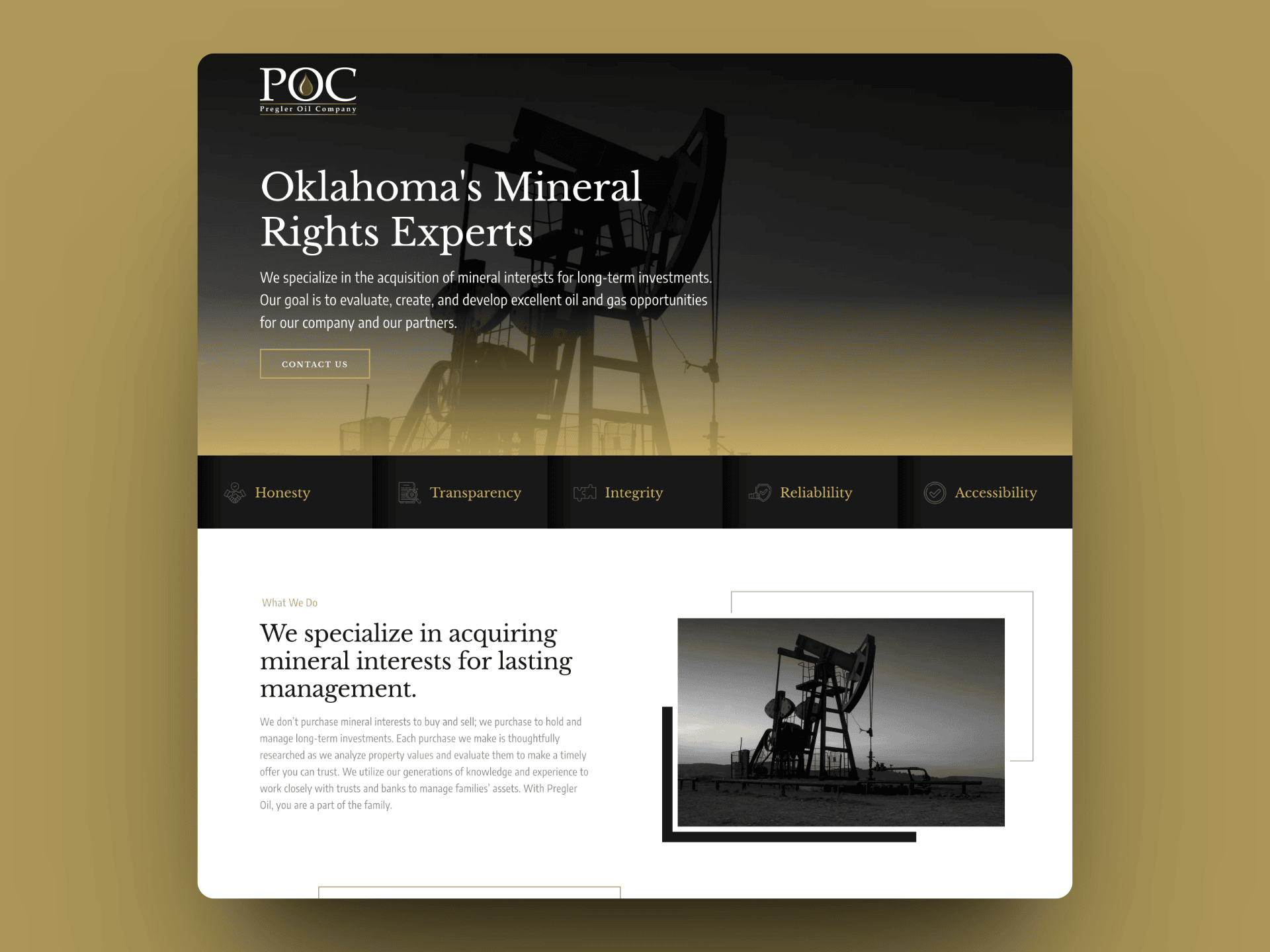
Pregler Oil
The Strategy
As a family-owned firm, we wanted potential customers to feel like they could get to know and trust them easily. Taking professional photos of the team was a key component. From a content perspective, we wanted to be informative and answer questions, so an FAQ section was important to include. As a primary call to action, we created a form that was quick and easy for clients to fill out and get more information.
The Design
The client wanted the look and feel to be modern, clean, and mostly black and white with accents of gold. Each section was built to be easy to navigate, and deliver an overall sense of professionalism and calm.
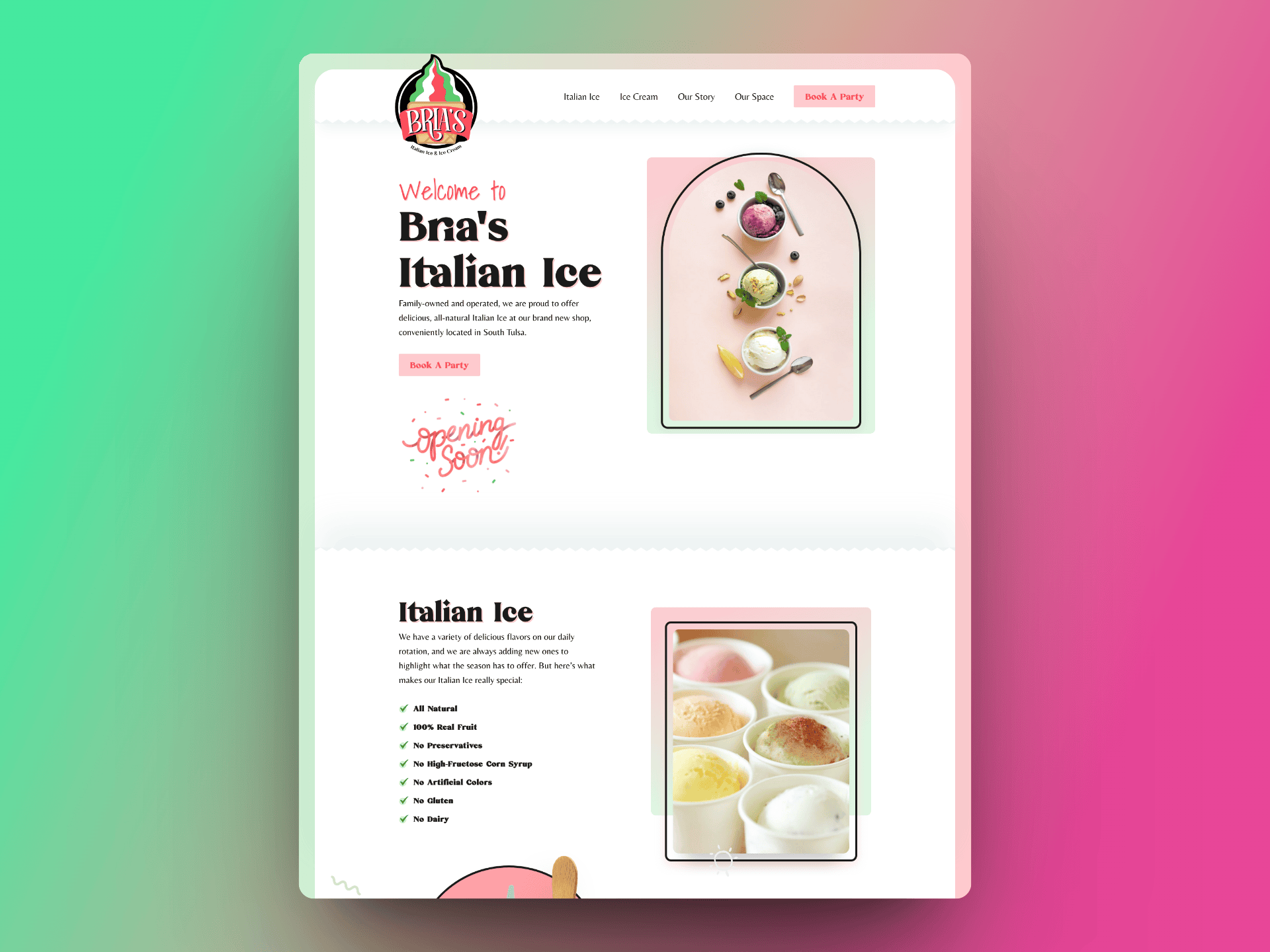
Bria’s Italian Ice
The Strategy
This site was pure joy to create. And there was definitely some product testing and research that just had to be done. Spoiler alert – the Italian Ice is DELICIOUS. If you are a Tulsa native, we’d recommend getting over to Bria’s Italian Ice immediately. We built this site prior to the opening date so that they had a place to send potential customers to for more information.
The Design
We wanted to bring in the colors of Italy, while keeping the overall vibe light, fun, and kid-friendly. The Italian Ice is free of major allergens and artificial flavors/colors etc, and that was important to feature. The storefront has a play space, patio, and drive-through that needed to be highlighted as well. From an operational perspective, the request to book a party needed to be easy to use, and work well as they plan to use this as the primary point of booking, so the form design and function was very important here.
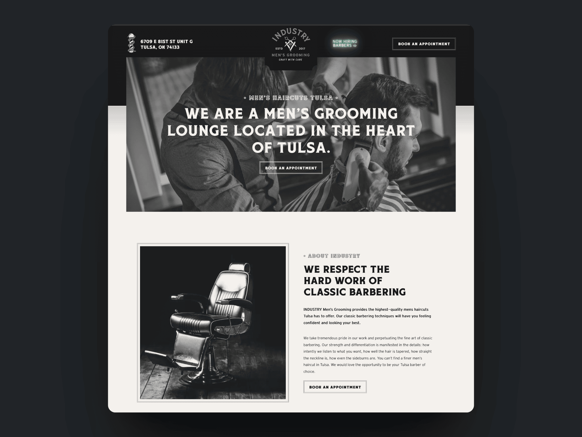
Industry Men’s Grooming
The Strategy
We built the first site for this client several years ago, and it was time for a refresh. They had recently moved into a larger, more modern space that is centrally located, and they wanted to highlight that as well as a few of their premium services and offerings.
The Design
At Industry, their client base is all men, so the site needed to feel masculine, rugged, and easy to navigate. We kept it modern with a black and white color scheme. They offer cold beers and beverages in a relaxing environment, making it the perfect place for a lunch break appointment. You can select your stylist, and book online with the push of a button. A beer and a haircut – what’s not to love?
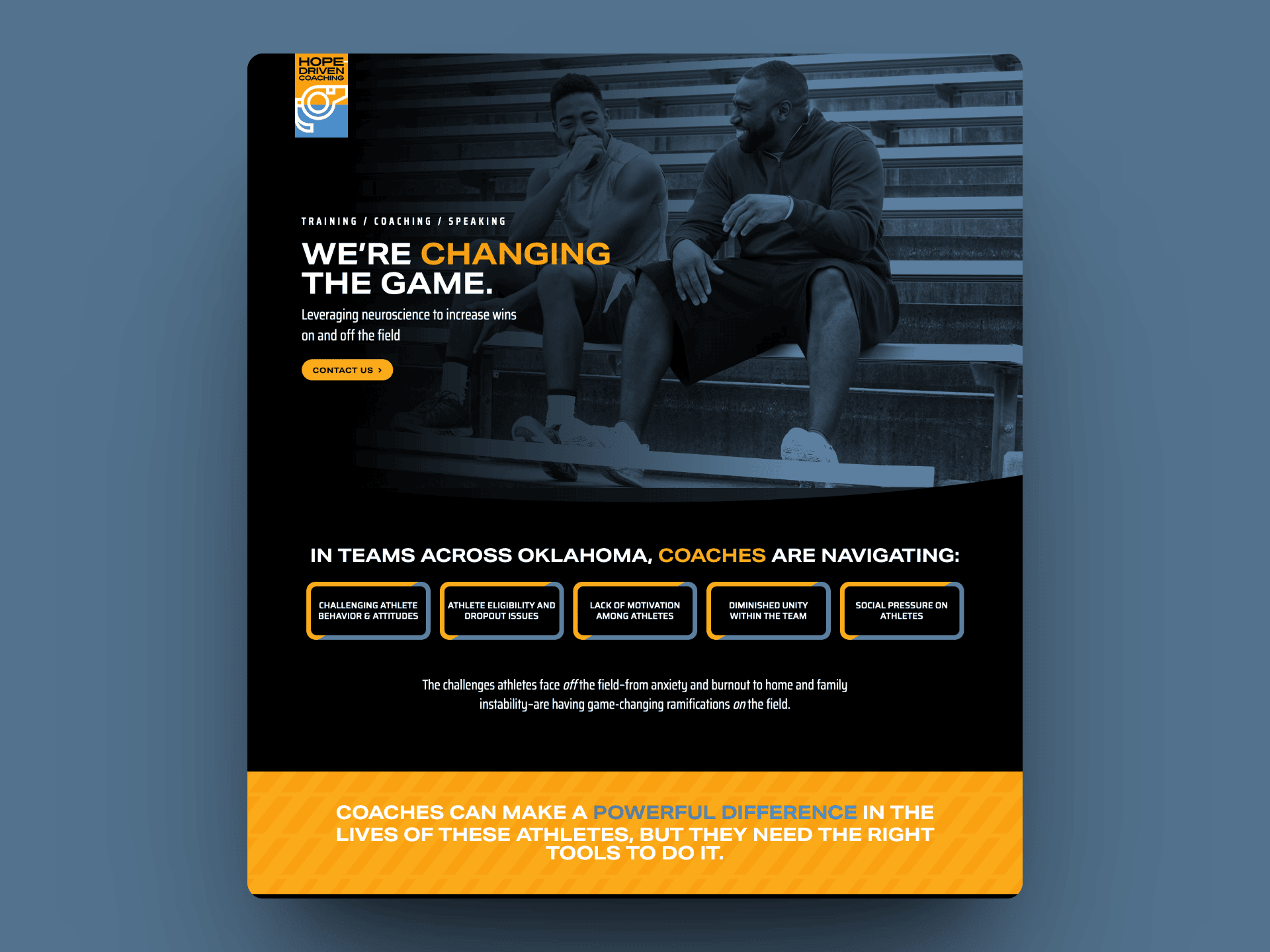
Hope-Driven Coaching
The Strategy
This project was unique because it was a smaller site that was part of a larger site. But because it was a separate initiative, it needed to have a unique look and feel, while still looking like it belonged to the larger brand.
The Design
The main site (Hope Rising) was primarily black, white, and yellow, so we kept the design in a similar color scheme, but added in a slate blue to match the logo of the Hope Coaching initiative. For this site, content was definitely king. The science and statistics needed to be front and center, so the overall layout and section design was tailored to the content to make it easy to read, and not feel overwhelming to the reader.
Still wondering if you need a microsite, or a full site? Here’s a helpful list you can use to help you decide. If you want to talk to a professional who can help guide you through the process, we would love to work with you, and learn more about your business.
A microsite could be a good fit for you if:
- Your business is new, with only a few basic products or services.
- The primary call to action can be understood and completed easily. For example, you want customers to call, email, text, or complete a form.
- You don’t have a large team. Maybe it’s just you, and you don’t need a big “Who We Are” page.
- You want to do SEO for a singular product or service or run Google Ads.
- You have a specific ad campaign you want to track.
- You have a specific initiative or offering that is part of a larger company but needs its own landing page, and look and feel.
- You are pressed for time.
- Your budget is limited.
A full site would be a better fit for you if:
- Your company has been around for a few years or more.
- You have recently expanded your products or services.
- You have a larger team.
- What you do needs to be explained in greater detail.
- You need specific pages to guide the customer experience: Pricing, Testimonials, Blog, Our Process, Calendar of Events etc.
- You want to do SEO for multiple products and/or services.
- You don’t have a tight deadline and just want things done right.
- Your budget is flexible.
